


UK Met Office State Of The Climate Report 2024 - What The Media Won't Tell You

All the usual apocalyptic hype with the release of the latest Met Office State of the Climate Report. Here’s just a few of the headlines:


I’ve read the report. Here’s the bits which Mad Miliband and the main stream media won’t be telling you.
Introduction
They decided not to focus exclusively on one year (2024) but to also present a comparison analysis for the decade 2015-24 vs, the climate normal 1961-90, and even further back, as far as 1900, with the intention of illustrating a more general climate trend, no doubt in order to scare us all with tales of just how much the climate has changed since it was damn near perfect, and entirely ‘safe’ and habitable allegedly, during those halcyon pre-industrial days of horse drawn carriages, open wood fires and candle-lit bread and scratching dinners.
This report presents summary statistics for the most recent year (2024) and decade (2015–2024). In comparison with previous reports, we have placed less emphasis on the most recent year and more on the most recent decade, representing a 10-year ‘snapshot’ of the UK's current climate from a climate change perspective. This period's relatively short length means that statistics for the latest decade may reflect shorter-term decadal variations as well as longer term trends. Even so, our climate is changing sufficiently fast that the climate of 2024 may be considered different to that of 2015, and this 10-year ‘snapshot’ is a compromise between these two competing factors. When considering the variability in the UK's climate, it is perhaps helpful to consider the observational series presented in this report as one realization of an ensemble of possible outcomes which, taken together, represent the UK's climate overall. While documenting the year 2024 is still important, this variability means that any individual year is less informative for providing overall climate change context.
We compare the most recent year and decade against the 30-year standard climate averaging period 1991–2020 and the baseline period 1961–1990, following World Meteorological Organization climatological best practice (WMO 2017). 1961–1990 is widely used for historical comparison, climate change monitoring, and climate modelling. We also include in several places statistics for 1931–1960 (for temperature, temperature indices, e.g., days of air frost and sunshine) and 1901–1930 and 1931–1960 (for rainfall), to better encompass the UK's climate of the 20th Century. The full series provides longer-term context, while a comparison is also made to centennial averages for the Central England Temperature (CET) series from 1659.
They’ve also decided to include a new analysis of extremes, because this is where the juiciest climate propaganda can be had. But by their own admission, the analysis is necessarily brief and not comprehensive.
Perhaps the greatest implication of the UK's changing climate is how this affects extremes. Monitoring changes in averages alone (e.g., annual mean temperature or rainfall) does not provide a complete picture of the state of the UK's climate. This report includes new analyses of daily temperature and monthly rainfall extremes, but a challenge of a summary report such as this, which aims to cover all main climate variables, is that it must be relatively brief, so these sections still present only summary statistics. The HadUK-Grid dataset is freely available for others to carry out more detailed analyses; the appendices provide details.
Observed temperature trend vs. climate models
You can see from the graph below that the mean temperature trend for the UK (black line) follows quite closely the multi-model mean for the moderate RCP4.5 emissions scenario.
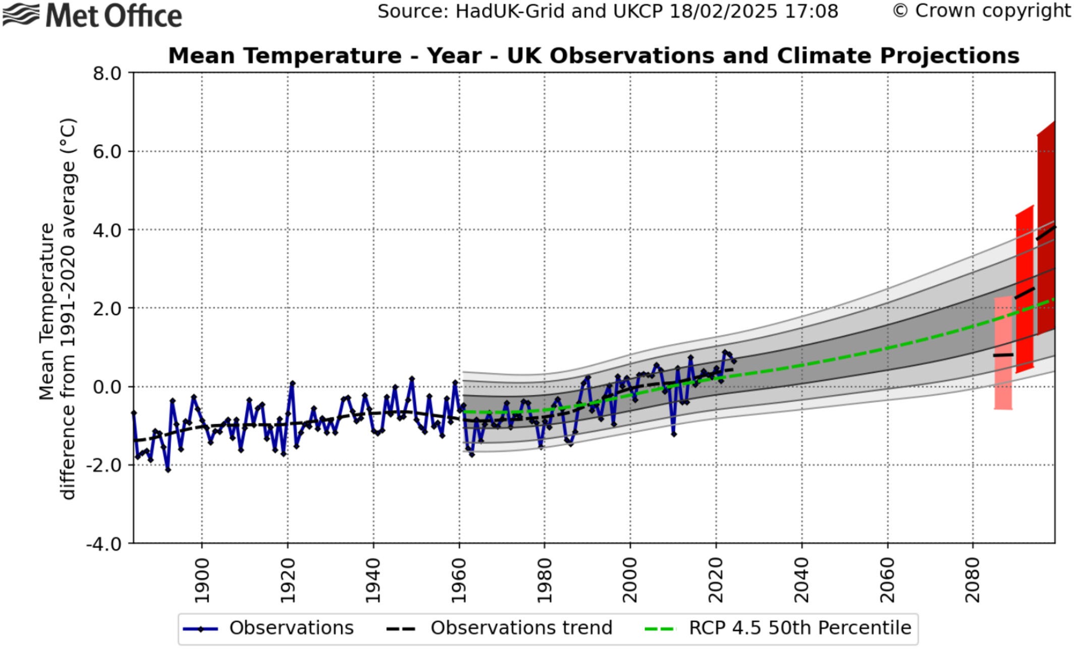

So according to this, we are already on an RCP4.5 pathway. The RCP8.5 projection is way off of the observations - far too hot. Yet the Met Office still insists on generating its scary extreme weather impacts and warming projections using RCP8.5 as a ‘business as usual’ scenario, providing climate change clickbait for the BBC and Guardian and justification for continuing with Net Zero policies in the vain hope that the rest of the world will follow our lead.
Precipitation
Since 1766, the rainfall in England and Wales looks like this:

Spot the trend. There isn’t one. The only short term trend is a steady increase from about 1975 to the present but annual rainfall records set in the latter half of the 18th and 19th centuries have still not been broken. The media says it’s getting wetter. England & Wales are not wetter than in the 1760s and 1870s. Scotland, however, has got a lot wetter since 1840. There are no proper records going back before then, so we don’t really know if the 18th century was very wet north of the border.
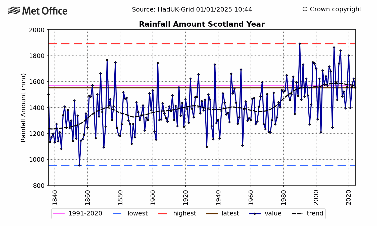
The Scots are currently being urged to use less water and switch to smart metering because ‘climate change’ is causing droughts apparently! Ever get the feeling we’re being had?
Extreme Short Period Rainfall
When the Met Office analyses days of intense rainfall, it only shows graphs going back to 1961, even though data goes back to 1891. Why is that?
Figure 28a–c shows the UK area-average annual number of days of rain greater than or equal to 1 mm (RR1), 10 mm (RR10) and rainfall intensity on wet days (the annual total precipitation on days with ≥ 1 mm divided by the annual count of days with ≥ 1 mm). Due to the large step down in station network density going back in time from 1961 to 1960, these series are shown from 1961, even though daily rainfall grids in the HadUK-Grid dataset extend back to 1891 (see Appendix A: HadUK-Grid Dataset). The table compares UK values for 1961–1990, 1991–2020 and the most recent decade 2015–2024.


The Met Office admits that the period used is too short, but this doesn’t stop them - and the media - claiming that ‘extreme weather is the new normal’. Dishonest in the extreme.
The limitation of the length of these series emphasizes the importance of future digitisation work before 1961. Earlier years will include a number of extreme daily rainfall events (such as the Norfolk rain storm of August 1912) which have been captured by observations but are yet to be digitized and fully included in the HadUK-Grid dataset (British Rainfall Organization 1913). Events such as this from over a century ago are a reminder that extreme rainfall has occurred in the UK prior to any influence from the warming climate. They demonstrate the importance of a long-term perspective on the variability of UK rainfall extremes in order to fully quantify the climate change signal.
Here are the extreme short period precipitation records for the UK. Notice something? The overwhelming majority occurred prior to the 20th century, one even in the late 19th century. So much for the ‘warmer air holds more moisture’ theory then. Or maybe it’s greedy warmer air, which doesn’t want to let go of its moisture!


Sunshine
Guess what? It’s got sunnier in the UK since 1910, especially during spring and winter. More short wave solar radiation penetrating to the surface, especially during spring, equals higher overall temperatures.
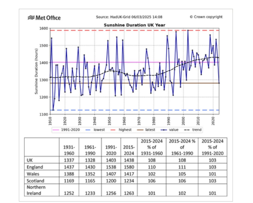
The Met Office neglects to mention this. In fact, after acknowledging that natural variability does impact the trends, the authors try to suggest that the increase in winter sunshine is also man-made!
These decadal statistics will reflect annual and decadal variability in the UK's climate in addition to the overall increasing sunshine trend. They will be influenced by a combination of natural variability and circulation changes, as well as other regional and global drivers such as those contributing to global dimming and brightening trends including direct and indirect response to aerosols (Wild 2009). Christidis et al. (2016) found evidence of human influence on winter sunshine extremes in the UK with the increase in winter sunshine most likely to be explained by reduced aerosol emissions.
Wind
Mean annual wind speed has decreased significantly in the UK since the 1970s - at a time when the government is building more and more wind turbines and offering even greater subsidies for companies to operate them!

Even extreme gusts associated with notable storms have become weaker since the 1980s/90s. So much for climate change supercharging storms then.

The most recent two decades have seen fewer occurrences of maximum gust speeds above these thresholds than during the previous decades, particularly comparing the period before and after 2000. For the UK overall there are no storms in recent years which compare in severity with exceptional storms in the observations such as the ‘Burns’ Day Storm’ of 25 January 1990, the ‘Boxing Day Storm’ of 26 December 1998 and the ‘Great Storm’ of 16th October 1987. The number of named storms affecting the UK each year and these earlier storms from the historical record demonstrate the ongoing risk of exceptionally severe wind storms hitting the UK.
Extreme Daily Temperatures By Month

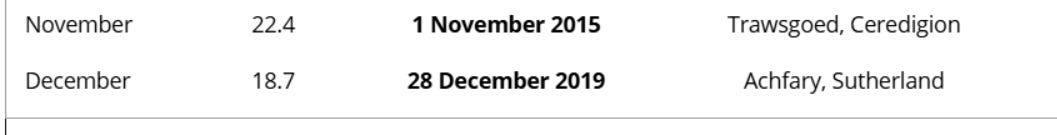
So despite the claim that temperatures are becoming more extreme, the majority of monthly extreme maximum temperature records were set prior to the 21st century, many occurring in the first half of the 20th century.
Summary
The claim that UK weather is becoming more extreme because of man-made global warming is not borne out by this latest report from the Met Office.
The UK has become generally wetter since the 1960s, especially during winter, but there is no real evidence of an overall trend in annual precipitation in England & Wales since 1766, evidence only of a significant wetting trend in Scotland since 1840. The evidence for an increase in extreme short period precipitation due to ‘climate change’ is non-existent.
Undeniably, the UK has become warmer across all seasons since the mid 19th century, but there is limited evidence for an increase in extreme monthly maximum temperatures and we have to now take declared maximum daily temperature extremes from the Met Office with a large pinch of salt, because sometimes the stations they are quoting don’t even exist, or they do exist and it just so happens that they’re recorded at an RAF base for all of 60 seconds when three typhoons happen to be landing!
Annual mean wind speeds across the UK have declined significantly since the 1970s, probably linked to natural North Atlantic internal variability. There is no evidence that ‘climate change’ is supercharging storms, making them wetter and stronger.
I'm still waiting for that Mediterranean climate they promised us.
It's getting hotter! They say. Good! I say. Most of the time it's fucking freezing.
This is what happens when you allow institutions like the Met Office to be run by aerosols.
Reducing the aerosol content of such institutions will make life sunnier for the rest of us.