


Global Boiling Is Toast - Will Global Cooling Be Sustained?

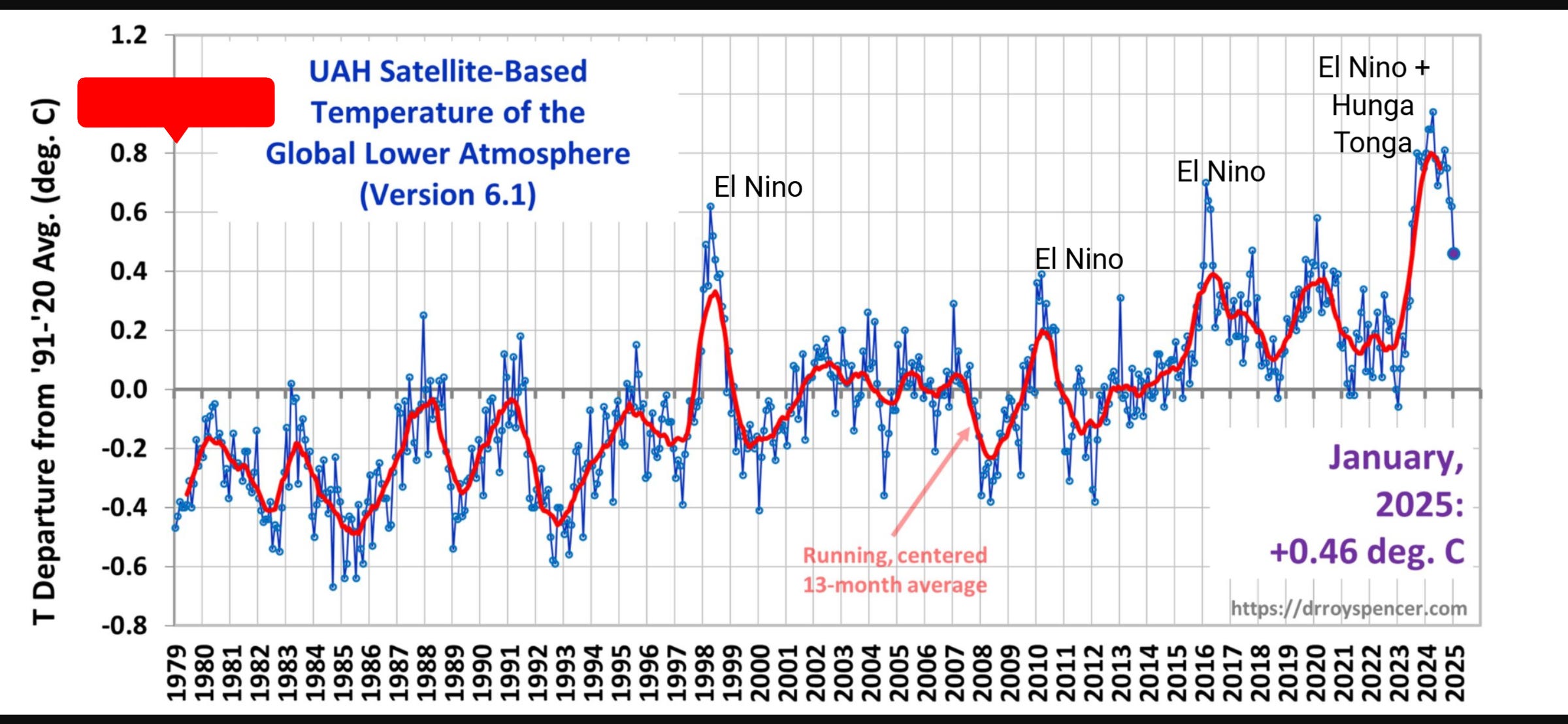
It’s over. The world is only as warm now as it was in 1998, just before the massive El Nino peaked. Cooling is now sharp and pronounced, just as it was in the aftermath of previous El Ninos. The difference this time is the world warmed because of Hunga Tonga, then some more because of a strong El Nino. The effect of both natural events is now fading rapidly.
How much cooler will it get? Will temperatures bounce back up to a new high plateau, as they did with the super El Ninos of 1998/97 and 2014/16, thus maintaining or even accelerating the long term warming trend? Yes, if the climate models are correct and the planet is overheating because of greenhouse gas emissions. Probably not, if nature is still in control of our climate. AMO has probably now peaked and despite surprising many observers by remaining very positive several years after it was predicted to start heading downwards, it surely will start to decline very soon, dragging global temperature down with it.

PDO has tanked. It’s the most negative it has been in over a hundred years.

If you’re not a natural climate change denier and you consider that a positive AMO plus PDO has contributed significantly to global warming since 1950, then you might expect the globe to cool significantly in the coming decades. In that case, the end of the Era of Global Boiling might turn out to be the far more significant end of the era of global warming - which will mean that the climate crisis loons will be trying to convince us all that warming really means cooling (because AMOC shutdown or something).
Nice annotations on the UAH temperature graph. You could have gone further and annotated all the saw-tooth spikes through the 1980s, 1990s and beyond as natural El Ninos, gradually ratcheting higher due to the reduced global cloud cover over that period. Even if you believe the UN PCC’s climate pseudo-science, it only predicts global warming due to atmospheric CO2 to be ~0.2°C per decade so the UAH graph shows indiscernible evidence of alleged man-made global warming since the series started in 1979.
To quote President Trump who is thankfully now calling the shots, “climate change is a hoax”.
I actually think they’re basically already doing that!