#Rep 1 - Attributing The 2018 Northern European Heatwave to Climate Change

Posted on 03 Aug 1808 Jul 19 by Jaime JessopIn Uncategorized11 Minutes Read
Rapid extreme weather attribution, aka climate ambulance chasing, has come of age and the attributors are in high demand:
For Friederike Otto, a climate modeller at the University of Oxford, UK, the past week has been a frenzy, as journalists clamoured for her views on climate change’s role in the summer heat. “It’s been mad,” she says. The usual scientific response is that severe heatwaves will become more frequent because of global warming. But Otto and her colleagues wanted to answer a more particular question: how had climate change influenced this specific heatwave? After three days’ work with computer models, they announced on 27 July that their preliminary analysis for northern Europe suggests that climate change made the heatwave more than twice as likely to occur in many places.
Soon, journalists might be able to get this kind of quick-fire analysis routinely from weather agencies, rather than on an ad hoc basis from academics. With Otto’s help, Germany’s national weather agency is preparing to be the first in the world to offer rapid assessments of global warming’s connection to particular meteorological events. By 2019 or 2020, the agency hopes to post its findings on social media almost instantly, with full public reports following one or two weeks after an event. “We want to quantify the influence of climate change on any atmospheric conditions that might bring extreme weather to Germany or central Europe,” says Paul Becker, vice-president of the weather agency, which is based in Offenbach. “The science is ripe to start doing it”.
So it will be just like getting the weather report, albeit just a few days or even just hours after the event, but in this case, you’ll get to know whether storm, heatwave, drought, deluge or freezing spell is simply ‘weather’, or whether it is all the fault of those nasty anthropogenic CO2 molecules which keep popping up in our atmosphere courtesy of our exhaust pipes and modish technological lifestyles. Presumably, if found guilty, we can then all engage in a universal display of repentance, lashing ourselves with the electrical flex ripped from the back of the new dishwasher or cinematic 60 inch flat screen TV with 3D surround sound, slash the tyres on the 4×4, and say ‘it’s a fair cop’ when the insurance company rejects our claim for damage to the roof because it was ‘not a natural disaster’. Oh yes, ’twill be fun.
But before we get too carried away, and start thinking about smashing up the old C-rated washing machine in an anguished fit of remorse, let’s take a look at the supposed damning scientific evidence that we did in fact cause ourselves to cook this summer in what will probably turn out to be the hottest, longest and driest heatwave in parts of northern Europe since way back when it was last this hot and dry. Take it away World Weather Attribution:
Here we present an attribution study of the ongoing heat wave made in near real time using well assessed methodologies. It is not peer-reviewed and was written quickly. We used thoroughly tested methods to do the analysis, evaluation of models and checked the observations for errors. The return times are partly based on forecasts and therefore have additional uncertainties. However, the changes in probability are based on past observations and model results, and the authors are confident that these results are robust. We are very grateful to Peter Thorne and Peter Thejll for making the Irish (from Met Eiréann) and Danish (from DMI) temperature observations available to us.
A summary of the key findings of this quick-fire attribution:
The heat (based on observations and forecast) is very extreme near the Arctic circle, but less extreme further south: return periods are about 10 years in southern Scandinavia and Ireland, five years in the Netherlands
From past observations and models we find that the probability of such a heatwave to occur has increased everywhere in this region due to anthropogenic climate change, although in Scandinavia this increase was not visible in observations until now due to the very variable summer weather.
We estimate that the probability to have such a heat or higher is generally more than two times higher today than if human activities had not altered climate.
Due to the underlying warming trend even record breaking events can be not very extreme but have relatively low return times in the current climate.
With global mean temperatures continuing to increase heat waves like this will become even less exceptional
The authors then define the event thus: “To define the event, we analyse the three-day maximum temperature average (TX3x) at individual locations.” This produces the heat map below:

Anomalies are with respect to the 1981-2010 climate normal. You will notice immediately that it has not been very hot, in fact really quite cool, across most of southern Europe. Presumably this is why the authors chose a number of weather stations in Ireland, northern Europe and Scandinavia to analyse the event. The station locations are:
Phoenix Park (Dublin, Ireland, 53.36N, -6.32E, 49.0m),
De Bilt (Netherlands, 52.10N, 5.18E, 1.9m),
Landbohøjskolen (Copenhagen, Denmark, 55.7N; 12.5E, 9m),
Oslo Blindern (Norway, 59.94N, 10.72E, 94.0m),
Linköping (Sweden, 58.40N, 15.53E, 93.0m),
Sodankyla (Finland, 67.37N, 26.63E, 179.0m) and
Jokioinen (Finland, 60.81N, 23.50E, 104.0m).
The authors explain the rationale:
In this article we do not analyse large area averages or country averages as in previous analyses of high temperatures but focus instead on a number of individual locations in Northern Europe where long records of observed data are available.
We firstly analyze observed temperatures and estimate how rare the current heat wave is, measured as three-day maximum temperatures, and whether or not there is a trend toward increasing temperature.
So basically, the actual analysis is only applicable for these 7 station locations, though obviously, regions outside these locations were affected by the anomalous weather too, the UK in particular; hence the numerous comparisons to 1976, 1995, 2003 etc. summer heatwaves.
They analyse the observed temps to see how rare they are in the context of the existing historical records and they also compare these with models:
Secondly, to assess the role of climate change, we compare observations with results from climate models that are available and suitable for the temperatures in these locations. This answers the question whether and to what extent external drivers, in particular human-caused climate change, can explain the temperature trends in the observational data. Including models allows us to give the causation of a trend.
This makes it very clear that the attribution stems from the use of the models. Now here’s where the fun starts:
Key Assumptions About AGW And Natural Variability
For transient simulations of the changing climate, we again calculate how the probability of the event is changing over time in the model data, by fitting the temperature values to a distribution that shifts proportional to the smoothed global mean temperature. This method assumes that global warming is the main factor affecting local temperatures since about 1900, and that virtually all global warming is attributable to anthropogenic factors. In Europe, with very little decadal variability, the first condition is met. The second assumption is the conclusion of the IPCC, but disregards the uncertainty surrounding it (IPCC WG1 AR5 Chapter 10).
My bold. The authors assume that all global warming since 1900 is anthropogenic and that this is the main factor affecting temperature at the specified locations. They justify these assumptions by reference to IPCC WG1 AR5 Ch. 10. They also state, bare-faced, that northern European climate is subject to very little decadal variability . . . .
Let’s deal with the second assumption first, that most or all global warming since 1900 is anthropogenic. Let us go to AR5 WG1 Ch. 10 and see what it says about the attribution of warming post 1900. When we do, we find it has an awful lot to say about attribution post 1950, stating it is extremely likely that most or all of the warming 1951-2010 is due to GHGs. 1900 to 2010, not so much. What it does say is this:
The pattern of warming and residual differences between models and observations indicate a role for circulation changes as a contributor to early 20th cenury warming (Figure 10.2), and the contribution of internal variability to the early 20th century warming has been analysed in several publications since the AR4. Crook and Forster (2011) find that the observed 1918–1940 warming was significantly greater than that simulated by most of the CMIP3 models. A distinguishing feature of the early 20th century warming is its pattern (Brönnimann, 2009) which shows the most pronounced warming in the Arctic during the cold season, followed by North America during the warm season, the North Atlantic Ocean and the tropics.
Some studies have suggested that the warming is a response to the AMO (Schlesinger and Ramankutty, 1994; Polyakov et al., 2005; Knight et al., 2006; Tung and Zhou, 2013), or a large but random expression of internal variability (Bengtsson et al., 2006; Wood and Overland, 2010)
Nonetheless, these studies do not challenge the AR4 assessment that external forcing very likely made a contribution to the warming over this period. In conclusion, the early 20th century warming is very unlikely to be due to internal variability alone. It remains difficult to quantify the contribution to this warming from internal variability, natural forcing and anthropogenic forcing, due to forcing and response uncertainties and incomplete observational coverage.
How does this square with the authors’ statement that “the second assumption is the conclusion of the IPCC, but disregards the uncertainty surrounding it (IPCC WG1 AR5 Chapter 10)”? Answer: it simply doesn’t. It is not their conclusion. They state that the uncertainties do not permit a quantifiable attribution of warming pre 1950, only that AGW likely made a contribution. In actual fact, numerous recent studies affirm the dominant role in 1910-1940s global warming of the AMO mode of internal variability combined with solar forcing, especially for the Arctic and locations bordering the North Atlantic (which just happens to be the region where the current heatwave is taking place!).
The IPCC statements also blow a hole in the first assumption of the report’s authors, i.e. that the station locations they’re analysing are subject to little decadal variability. The IPCC clearly mention the importance of the AMO which affects precisely this region. Northern European climate is subject to a lot of multi-decadal internal variability, principally by the AMO which has a cycle length of approximately 70 years, which is more than sufficient to have affected temperatures at the specified locations from 1900 to the present! For the avoidance of doubt in this respect:
The Atlantic multidecadal oscillation (AMO) explains over 90% of the pronounced decadal temperature and summer precipitation variation. Understanding the impact of these ocean variations when interpreting long climate records, particularly in the context of a changing climate, is crucial.
[https://rmets.onlinelibrary.wiley.com/doi/full/10.1002/wea.2543]
That rather buggers up the supposedly eminently suitable data from Phoenix Park, Dublin, with regards to demonstrating the probability of extreme weather supposedly unaffected by the presence of natural climate variability, subject only to anthropogenic influences!
The story is not much different for the other locations, all of which are subject to the influence of Atlantic multi-decadal variability.
Thus the two main assumptions of the WWA rapid attribution report are proven false:
The locations used are subject to significant natural multi-decadal/decadal variability.
Anthropogenic GHGs are unlikely to have dominated global warming prior to 1950.
Not good, but that’s not the end of it.
The Observations Disagree With The Models
As mentioned, the analysis uses models to estimate the likely anthropogenic influence. Here’s what the authors say about the model fit vs. data at the various stations:
Dublin Phoenix Park: Only two models had variability compatible with the observations (EUROCORDEX has 30% too much variability but we decided to keep it; EC-Earth is fine but is also downscaled by RACMO, which fits the observations even better). The Risk Ratio is about two in all estimates, the straight average of observations and the two models gives a Risk Ratio of 2.0 with a 95% uncertainty interval of 1.2 … 3.3.
De Bilt: Observations show a much bigger increase in probability than the models, which also show some spreads. We verified that the trend is the same at the other homogenised non-coastal stations in the Netherlands (Eelde and Maastricht). Starting in 1951, and hence avoiding the breaks altogether, gives even higher trends and hence Risk Ratios. The same mismatch extends into Central Europe and has been discussed by Min et al., 2012 and Sippel et al., 2016. The cause is as yet unknown, so the best we can do at this moment is to average these values (on a logarithmic scale) leading to an increase in probability of very roughly a factor three, and definitely larger than one.
Copenhagen Landbohøjskolen: Both models with variability that is compatible with the observations show a somewhat stronger increase than the observed trend, but within uncertainties the results are reasonably compatible (χ²/dof=3.4). The average Risk ratio is roughly five (larger than 2.4).
The Scandinavian stations are even worse:
Oslo Blindern: The observed trend has large uncertainties and is therefore compatible with both models that have realistic variability. The two models with realistic variability agree well. The average gives a Risk Ratio between 1 and 10, so we can say that the probability increased but not very well by how much.
Linköping (Sweden): Again there is huge uncertainty in the observed trend. The EUROCORDEX ensemble has a higher trend than the other two models, so we cannot say much more than there is definitely an increase in probability for heat waves.
Sodankyla: In the high Arctic, the uncertainties both on the observations and on the climate models are enormous. Given the strong positive trends in the climate models, and the possibility of a positive trend in the observations, we can state that the trend is positive but nothing more. Note that the scale extends over eight orders of magnitude.
Jokioinen: The same holds for the more southerly station in Finland.
The authors explain the rationale behind choosing individual stations, even though the mismatch between observations and models is plainly a problem. Basically, it’s because real people live in these locations, not statistically spread out across wide regions, so the attribution result is more pertinent!
In our analysis we have looked at local weather stations in northern Europe where people are experiencing the heat wave today. In individual locations the interannual variability in summer temperatures is much larger than if we would average over countries or the whole region that is experiencing a heat wave in the early summer of 2018. The climate change signal is thus harder to detect from the noise in individual places. However, it is towns and villages where people live and not area averages, hence we chose to focus on stations only in this analysis.
In summary, here is what the authors have to say about the observations and the models for the particular locations used in their attribution study:
In Ireland, the Netherlands and Denmark there are clear trends towards more heat waves in the observations. In Ireland and Denmark climate models give a very similar increase in probabilities to the observations — roughly a factor two more likely in Dublin and a factor four in Denmark. In the Netherlands the observed increase in hot extremes is much larger than the modeled increase. This is a well-known problem (Min et al, 2013, Sippel et al, 2016) but the cause has not yet been elucidated.
However, this is not the case further north. No trend is currently detectable in the observations there. However, due to the large variability of the summer weather, the uncertainty in the trends is so large that the observations are also compatible with large changes in the likelihood of heat extremes to occur. In the case of Scandinavia, the models are thus probably a better source to estimate the change in likelihood as we have large ensembles of model experiments.
Does all this inspire much confidence in the use of these models and observations combined to attribute the influence of anthropogenic climate change upon the 2018 heatwave in Europe and Scandinavia?
Does it inspire much confidence in this Guardian headline, outlining the results of this rapid attribution study?
Heatwave made more than twice as likely by climate change, scientists find
Fingerprints of global warming clear, they say, after comparing northern Europe’s scorching summer with records and computer models
I have to say: no, it bloody well doesn’t! But, as usual, it’s out there now, all across the media airwaves; climate alarmists everywhere are saying ‘the science is in – climate change did cause the 2018 northern European heatwave’. 99% of them probably haven’t even bothered to read the actual study which purports to be ‘the science’.
Those of us who do not leap at the opportunity to believe in the magic science of extreme weather attribution will note the massive and unexpected cooling in the tropical and Northern Atlantic this year and question whether this has had any influence at all upon the concurrent heatwave in northern Europe. Joe Bastardi has an excellent Patriot Post article on exactly this.
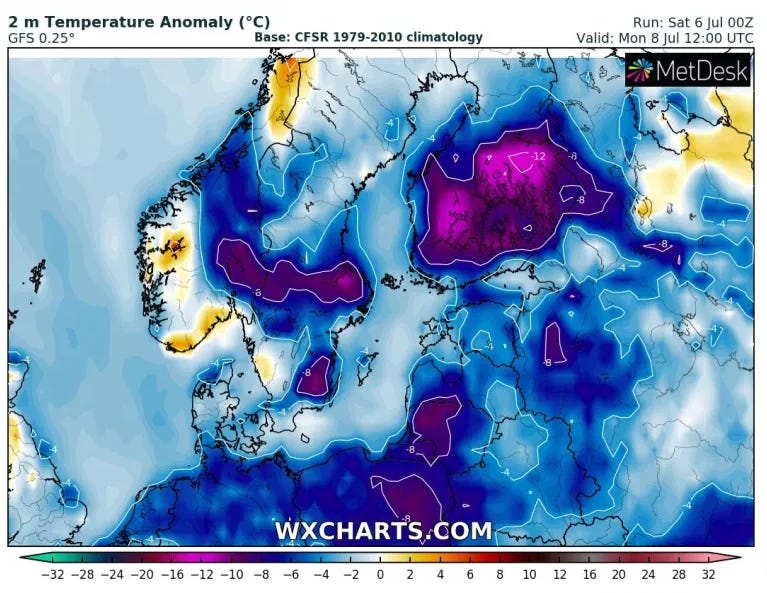
Update: 08/07/2019
What a difference a year makes: